By Irwan Ismail | July 26, 2012
The Malaysian Insider
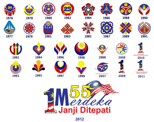
KUALA LUMPUR, July 26 — The 2012 National Day logo has received wide criticism since it was released this week, with cyber citizens and graphic designers saying it is the worst they have seen and not suitable for the celebration that stretches from August 31 to September 16 which is Malaysia Day.
The government eschewed the traditional logo designing competition this year, leaving the Information Department to come out with the logo which comprises words in different fonts, the Jalur Gemilang, the 1 Malaysia logo and theme “Janji Ditepati” (Promises Fulfilled), all using the four colours of the national flag.
“It’s not even a logo from designer’s point of view. Too many things going on in one piece — logo in a logo, so many fonts, no strong visual message, no hierarchy in typography,” said Imran Abdul Jabar, the founder of sifoo.com, a website dedicated to multimedia design.
He said a logo should be able to stand on its own without the addition of images, illustrations, effects and colours.
“That ‘logo’, or whatever name it is, is not even close to reflecting the spirit of our National or Independence Day. Such a disgrace to the pride of our nation, let alone our creative industry,” Imran said.
Graphic designer Muhammad Azizi agreed with Imran, saying that this year’s logo was an outdated design and lacked creativity.
“There are too many fonts for a logo design and a lack of meaning to relate to the theme. Those in charge need to consider opinions from experts in the design industry,” he told The Malaysian Insider.
To add to the diatribe against the logo, many also made fun of the explanation for the logo, which is available here.
In social networking websites such as Twitter and Facebook, many queried Putrajaya for not having a competition as done previously.
There is even a Facebook group named “Kami Bantah Logo Kemerdekaan Malaysia Ke 55” that questions the tagline “Janji Ditepati”, saying it does not make sense and appears political. The Facebook page has 2,600 members and is growing since it started on July 24.
Activist Datuk Paduka Marina Mahathir also weighed in on the furore, writing in her Facebook page that “obviously our Ministry of Information’s graphic designer just discovered all the fun of Photoshop and decided to bung everything it all at once…”
According to those in the commercial design industry, it is common for clients to make changes although initial designs are good enough but they are not sure what happened with this year’s logo.
“Local designers and design practitioners in Malaysia hope that the logo can be changed for the better,” said one designer, who declined to be named.

#1 by yhsiew on Thursday, 26 July 2012 - 12:00 pm
This year’s logo is special because this is the last logo by the BN government. The rakyat will have a glorious logo next year when Pakatan Rakyat takes over Putrajaya from BN.
#2 by sheriff singh on Thursday, 26 July 2012 - 12:03 pm
A Lim Kok Wing University of Creative Technology undergrad can do a much better and honest job. They have more talent there than the Information Department and all the Ministries combined.
#3 by dagen wanna "ABU" on Thursday, 26 July 2012 - 12:30 pm
Ewwwwwwww. Apa benda tu?
#4 by sheriff singh on Thursday, 26 July 2012 - 12:31 pm
Now that I have seen all the logos, my impression is that they are all ‘ghastly’ (in design).
#5 by megaman on Thursday, 26 July 2012 - 1:42 pm
Some of the logos are created in the 70s and 80s …
Tats the common style during that eras, if you compare with logos (even corporate ones) from the same period, they are considered not too bad.
Errmm … btw wat happened to 2001 to 2006 ? No logos ?
Hehe … Looks like after Najib became PM, it all became a big 1 with more n more fine text …
Sigh !!!
#6 by sheriff singh on Thursday, 26 July 2012 - 12:32 pm
Benda itu ‘Batman’ logo-lah.
#7 by monsterball on Thursday, 26 July 2012 - 1:01 pm
One look at a professional logo….you get the message.
The 2012 logo is low class…cheap with few messages put into one logo.
It’s more like a designer coming out with it than a proper advertising person.
What do you expect from one who is experts in stealing and plundering.
#8 by monsterball on Thursday, 26 July 2012 - 1:03 pm
One look at any professional logo….you get the message.
The 2012 logo have few messages put into one.
It’s more like a designer doing it that a proper advertising person.
#9 by bennylohstocks on Thursday, 26 July 2012 - 10:47 pm
THE REAL MERDEKA DEAL
#10 by sheriff singh on Thursday, 26 July 2012 - 11:05 pm
My impression of all the logos is that they all look like they are taken from the handicrafts and artworks of some aboriginal tribes (no offence intended, just impressions). Put them all together and you might get a Red Indian Totem Pole that tell some stories.
#11 by PoliticoKat on Sunday, 29 July 2012 - 2:01 am
I think 2007 logo looks the best.
2012 is not a logo. It is an advert. A political advert.
Where is the logo? It is just a text block.
1Merdeka?
Ah… can we drop that whole 1concept?
I don’t feel any ones with DPM calling me a pendatang.